|
How do I choose a name, complimenting phrase, symbol, colors, and font that will express potential for growth, community, collaboration, diversity, and fun? That is hard. I began with a few ideas in mind. I wanted to incorporate a rainbow, yet I wanted simplicity at the same time--not busy graphics. It should have a “village” feel. I knew I also wanted my logo to look contemporary. I like tropical, bright and fruity colors. www.logomakr.com: Selecting the symbol was nice on this site. You get pages of full sized symbols that can be searched and sorted by category. However, adjusting colors is difficult in my opinion because I don’t like trying to pinpoint a specific color from a blended rainbow. It’s too hard to even see the color you are trying to find. Also, there is not much guidance on this site in the way of layout. You have to move the elements where you think they should go. A little too much control.  Freelogodesign.com I didn’t like this site because you only enter your name and category, then have to keep scrolling through random graphics and fonts. 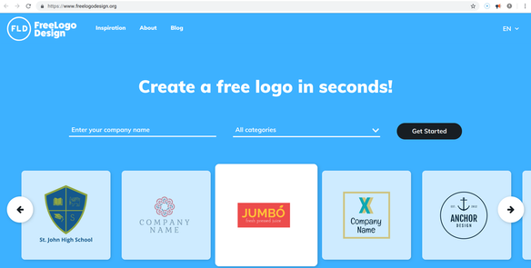 Looka.com User selects a variety of color schemes and symbols to start with. I thought the program would blend my choices, or find a trend of what I liked--but I was really disappointed with the sample it created. Editing the background, font, and graphic was a bit tricky. It wasn’t very user-friendly. 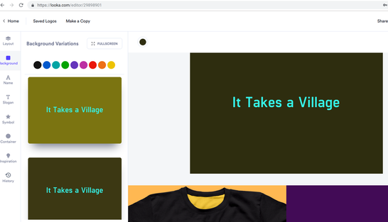 !Canva.com Many of the graphics on other sites were too busy, but this graphic was exactly what I wanted: It symbolizes community, diversity, togetherness. The background and fonts were pre-paired and classy. It was easy to choose a template and user friendly to make adjustments. The premium graphic I selected was only a dollar! Although this is just a first draft, I think this one is a winner! 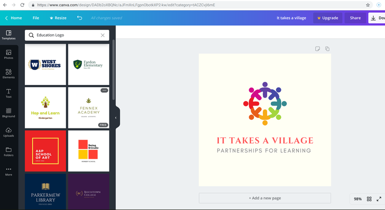
2 Comments
Catalina Goldstein
6/14/2019 10:49:36 am
I love that you didn't settle for less on your logo. The rainbow figures are so cute. I have major logo envy right now!!! I'm definitely going to be giving !canva a try.
Tess
6/16/2019 05:34:28 pm
Oh, wow! your final logo is so great! I love the colors. I reviewed logomakr. I wrote that it was clunky and so not flashy. You can totaly see what I meant when you compare !canva and logomakr. !Canva looks sharp and professional. Good job! Leave a Reply. |
 RSS Feed